
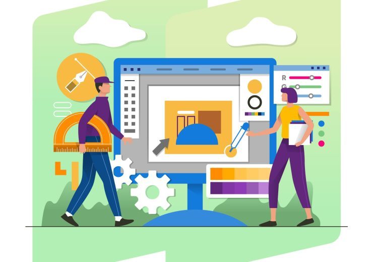
The Benefits of Responsive Web Design

In today’s digital age, having a strong online presence is essential for businesses and individuals alike. Your website serves as your virtual storefront, and the way it looks and functions can significantly impact how users perceive your brand. One of the key elements that contribute to a successful online presence is responsive web design.
Responsive web design is not just a trendy buzzword; it’s a fundamental approach to web development that ensures your website adapts to various screen sizes and devices. Whether your audience accesses your site on a desktop computer, smartphone, tablet, or any other device, responsive design ensures that the user experience remains consistent and user-friendly.
In this article, we will explore the numerous benefits of responsive web design and answer some frequently asked questions to help you understand why it’s crucial for your online success.
Benefits of Responsive Web Design
1. Improved User Experience
The primary goal of responsive web design is to create a seamless and enjoyable user experience across all devices. When your website is responsive, visitors can easily navigate, read, and interact with your content, regardless of the device they use. No more zooming in or out, scrolling endlessly, or dealing with distorted images and text. This enhanced user experience leads to higher user satisfaction, longer visit durations, and increased conversion rates.
2. Better SEO Rankings
Search engine optimization (SEO) is critical for driving organic traffic to your website. Google, the most popular search engine, rewards mobile-friendly websites with higher rankings in its search results. By implementing responsive design, you create a consistent web presence across devices, which can positively impact your SEO efforts. Additionally, managing a single website with responsive design is more efficient than maintaining separate mobile and desktop versions.
3. Increased Reach
With the proliferation of mobile devices, your website needs to be accessible to a wide range of users. Responsive design ensures that your content reaches the maximum audience possible, regardless of their preferred device. Whether your target audience uses smartphones, tablets, or desktops, your site will look and function flawlessly, making it more accessible and engaging.
4. Cost-Efficiency
Maintaining multiple versions of your website for different devices can be time-consuming and costly. Responsive web design eliminates the need for separate mobile and desktop sites, as a single responsive site adapts to all screen sizes and resolutions. This streamlines your web development and maintenance efforts, reducing costs and simplifying updates.
5. Faster Loading Times
Responsive websites are optimized for speed. Since there’s only one version of your site to load, it typically loads faster than multiple versions. Faster loading times not only improve user experience but also contribute to better SEO rankings, as search engines favor faster websites. This can lead to higher search engine visibility and more organic traffic.
6. Consistency in Branding
Maintaining a consistent brand image across all devices is essential for building trust and recognition. Responsive design ensures that your branding elements, such as logos, colors, and fonts, remain consistent, regardless of the device. This consistency reinforces your brand identity and helps users feel more familiar with your website, increasing their trust and loyalty.
7. Future-Proofing
The digital landscape is constantly evolving, with new devices and screen sizes emerging regularly. Responsive web design is future-proof, as it allows your website to adapt to new technologies and devices without the need for a complete redesign. This flexibility ensures that your website remains relevant and functional for years to come.
8. Enhanced Analytics
Managing a single website with responsive design simplifies your analytics tracking. You can gather and analyze data from all devices in one place, gaining valuable insights into user behavior and preferences. This data can help you make informed decisions to further improve your website’s performance and user experience.
Conclusion
Responsive web design is not just a trend; it’s a necessity in today’s digital landscape. The benefits of responsive design, including improved user experience, better SEO rankings, increased reach, cost-efficiency, and more, make it a must-have for businesses and individuals aiming to succeed online.
By embracing responsive web design, you can provide a consistent and engaging experience to users across all devices, enhance your brand image, and stay competitive in an ever-evolving digital world. So, if you haven’t already, consider investing in responsive web design to ensure your website stands out and delivers results in the age of digital connectivity.
FAQs About Responsive Web Design
1. What is responsive web design, and how does it work?
Responsive web design is an approach to web development that ensures a website’s layout and content adapt fluidly to different screen sizes and devices. It employs flexible grid layouts, images, and CSS media queries to achieve this adaptability. When a user accesses a responsive website, the site detects the device’s screen size and adjusts its layout and content accordingly, providing an optimal viewing experience.
2. Is responsive web design necessary for my business?
Yes, responsive web design is essential for any business or individual with an online presence. With the increasing use of smartphones and tablets, a significant portion of internet traffic comes from mobile devices. Failing to provide a responsive experience can lead to frustrated users and missed opportunities.
3. How can I test if my website is responsive?
You can easily test your website’s responsiveness by manually resizing your browser window on a desktop or by using online tools like Google’s Mobile-Friendly Test or BrowserStack’s responsive design checker. These tools will show you how your website appears on various screen sizes and provide feedback on its responsiveness.
4. Can I retrofit an existing website with responsive design?
Yes, it’s possible to retrofit an existing website with responsive design. However, the complexity of the process depends on your site’s current structure and design. In some cases, it may require a significant redesign and redevelopment effort. It’s often more cost-effective to implement responsive design from the outset or during a website redesign.
5. How can I find a web designer or developer experienced in responsive design?
To find a qualified web designer or developer experienced in responsive design, consider asking for recommendations from colleagues or other business owners. You can also browse online portfolios and reviews to assess their previous work. When hiring, ensure that the candidate has a strong understanding of responsive design principles and can provide examples of responsive websites they’ve created.